Why Web Design Trends Matter for Business
Your website is your most powerful sales tool — and first impressions form in under 50 milliseconds. According to research from the Nielsen Norman Group, users judge the credibility of a business largely based on visual design before reading a single word. A site that looks dated signals to visitors that your brand may be out of touch, while a modern, well-crafted design communicates professionalism, authority, and trustworthiness.
But keeping up with web design trends isn't just about aesthetics. The best trends of 2024 are rooted in performance, usability, and conversion. They reflect how real people browse the web today — on mobile devices, in low-light environments, with varying abilities and connection speeds. Adopting the right trends can directly lift your engagement metrics, reduce bounce rates, and drive more leads.
This guide breaks down the six most impactful web design trends of 2024, what's losing steam, and exactly how to apply these insights to your own website — whether you're building from scratch or refreshing an existing site.
Trend 1: AI-Generated and AI-Assisted Design
Artificial intelligence has moved from buzzword to practical design tool practically overnight. In 2024, designers are using AI at every stage of the creative process — from generating initial visual concepts and custom illustrations to automating layout suggestions and personalizing user experiences in real time.
Tools like Adobe Firefly, Midjourney, and Figma's AI-powered plugins allow designers to prototype faster, experiment with more visual directions, and deliver unique imagery without the cost of a full photography or illustration budget. Platforms like Webflow's Blog have extensively covered how AI is reshaping no-code and low-code design workflows.
What does this mean for your business website?
- Custom AI-generated illustrations replace stock photography, giving your brand a distinctive visual identity.
- AI-driven personalization adapts content, calls-to-action, and product recommendations based on visitor behavior.
- Automated A/B testing of layout and color variants becomes faster and data-driven rather than guesswork.
- Chatbots and conversational UI powered by large language models handle visitor questions instantly, improving conversion without adding headcount.
The key caution: AI-assisted design should still be guided by human judgment. Layouts generated purely by AI often lack the strategic intent and emotional storytelling that connect with real audiences. Use AI to accelerate — not replace — thoughtful design decisions.
Trend 2: Bold Typography and Kinetic Text
Typography has become the hero of modern web design. Brands are moving away from safe, neutral fonts and embracing oversized, expressive typefaces that carry personality and immediate visual impact. This trend is particularly strong on landing pages and hero sections, where a single headline set in a dramatic weight or unexpected typeface can do the work that used to require elaborate imagery.
Kinetic typography — text that moves, scrolls, rotates, or morphs as the user interacts with the page — takes this further. Showcased regularly on Awwwards, some of the most celebrated sites of 2024 use animated type as a primary visual element rather than a decorative accent.
How to implement bold typography effectively:
- Choose one expressive display font for headlines and pair it with a highly readable body font.
- Use variable fonts to balance visual weight with fast load times — a single variable font file replaces multiple weight files.
- Keep kinetic effects purposeful: animate text to guide attention or reinforce messaging, not just for visual novelty.
- Test readability at all screen sizes — bold headlines that work on desktop may need size adjustments on mobile.
- Respect user preferences for reduced motion by wrapping animations in a
prefers-reduced-motionmedia query.
CSS-Tricks has an excellent library of tutorials covering variable fonts and CSS-based text animations if you want to implement these effects without heavy JavaScript libraries.

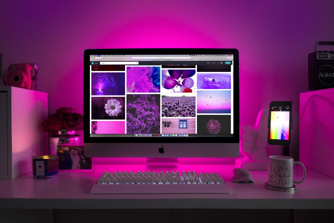
Trend 3: Dark Mode Design
Dark mode has graduated from a niche preference to a mainstream expectation. Operating systems, apps, and websites that don't offer a dark mode experience are increasingly seen as incomplete. According to data cited by HubSpot's Website Blog, over 80% of users now actively use dark mode on at least one of their devices.
For designers, dark mode is far more nuanced than simply inverting colors. Done well, it requires rethinking the entire visual hierarchy — choosing colors that maintain contrast ratios, ensuring images look good on dark backgrounds, and using depth through subtle shadows and layered dark tones rather than stark black-and-white contrast.
Best practices for dark mode implementation:
- Use the CSS
prefers-color-schememedia query to automatically serve dark or light styles based on the user's OS setting. - Avoid pure black (#000000) backgrounds — dark grays like #121212 or #1a1a2e are easier on the eyes and allow for layering depth.
- Desaturate brand colors slightly for dark backgrounds to prevent harsh glare.
- Audit all images and icons — transparent PNGs that look great on white may appear broken on dark backgrounds.
- Include a manual toggle so users can override the OS preference on your site.
For a deep dive on accessible color choices in dark interfaces, the Smashing Magazine dark mode design guide is an essential read.
Trend 4: Micro-Interactions and Animation
Micro-interactions are the small, purposeful animations that respond to user actions — a button that subtly presses when clicked, a form field that highlights on focus, a navigation item that underlines as the cursor approaches. These details feel minor in isolation, but collectively they create a sense of responsiveness and polish that separates average sites from exceptional ones.
In 2024, micro-interactions have expanded beyond hover states into scroll-triggered animations, progress indicators, and loading sequences that keep users engaged and reduce perceived wait times. As covered extensively on A List Apart, thoughtful animation is one of the most reliable tools for communicating feedback, guiding attention, and building emotional connection with digital products.
The most effective micro-interactions share three qualities:
- Speed: They complete in 200-500ms — fast enough to feel snappy, slow enough to be perceptible.
- Purpose: They communicate something — a state change, a confirmation, a direction — rather than decorating.
- Restraint: They are used selectively. A site where everything animates becomes overwhelming and distracting.
Good UX design principles demand that every animation earns its place by improving the user experience, not just demonstrating technical capability. Start with your primary CTAs, form interactions, and navigation — these are the highest-value touchpoints for animation investment.
Trend 5: Glassmorphism and Bento Grid Layouts
Two distinct visual languages are dominating the design landscape in 2026: glassmorphism and bento grid layouts.
Glassmorphism creates a frosted-glass effect using CSS backdrop filters, semi-transparent backgrounds, and subtle border highlights. When layered over rich gradient or image backgrounds, it produces a depth and dimensionality that feels contemporary and premium. Apple popularized this look in iOS and macOS, and it has spread rapidly across web design. The effect works especially well for cards, modals, navigation bars, and pricing panels.
Bento grid layouts — named for the segmented Japanese lunch boxes — organize content into asymmetric, modular tiles of varying sizes on a grid. Made famous by Apple's product pages and the dashboards of modern SaaS tools, bento grids give designers a structured but flexible system for displaying multiple pieces of content without the rigidity of traditional column layouts. They work particularly well for feature showcases, portfolio grids, and dashboard UIs.
Creative Bloq regularly features outstanding examples of both trends in their design inspiration roundups — a useful resource for gathering visual references before briefing your design team.
When adopting these trends, prioritize performance. Glassmorphism effects using backdrop-filter can be GPU-intensive on lower-end devices. Always test across devices and use progressive enhancement so the experience degrades gracefully on browsers with limited support.
Trend 6: Accessible and Inclusive Design
Accessibility has moved from a compliance checkbox to a core design value — and rightly so. Approximately 1 in 4 adults in the United States lives with some form of disability, and globally, over a billion people experience disability that affects how they use the web. Sites that are not accessible exclude a massive potential audience and expose businesses to increasing legal risk under standards like WCAG 2.1 and the ADA.
In 2024, the leading design teams are going beyond minimum compliance to embrace genuinely inclusive design — building experiences that work for everyone regardless of visual, motor, cognitive, or auditory ability. This intersects directly with mobile-first design, since many accessibility improvements — larger tap targets, simplified navigation, reduced cognitive load — also improve the mobile experience for all users.
Practical accessibility improvements to implement today:
- Ensure all text meets WCAG AA contrast ratios (4.5:1 for body text, 3:1 for large text).
- Add descriptive alt text to every meaningful image and leave alt text empty (
alt="") for purely decorative images. - Build keyboard-navigable interfaces — every interactive element should be reachable and operable without a mouse.
- Use semantic HTML elements (headings, landmarks, lists) so screen readers can interpret page structure correctly.
- Provide captions and transcripts for all video and audio content.
- Test with real assistive technology — screen readers like VoiceOver (Mac/iOS) and NVDA (Windows) reveal issues that automated scanners miss.
Accessible design is not a constraint on creativity — it's a framework that forces clarity and intention, which consistently produces better design for everyone.
What's Fading Out in 2026
Just as important as knowing what's trending is recognizing what's losing relevance. Holding onto outdated design patterns can undermine the credibility of an otherwise strong brand.
These design approaches are falling out of favor in 2026:
- Generic stock photography: Smiling people in offices and handshakes in boardrooms instantly read as inauthentic. Custom photography, authentic user-generated content, and AI-generated imagery are replacing stock images across the board.
- Cluttered, text-heavy homepages: Visitors scan before they read. Pages that lead with dense paragraphs and no clear visual hierarchy lose users within seconds.
- Carousels and sliders: Decades of user research confirm that content beyond the first slide of a carousel is rarely seen. Static featured content with clear navigation outperforms sliders on every conversion metric.
- Centered body text: While centered text works for short headlines and CTAs, centering body paragraphs reduces readability significantly and feels dated.
- Flat design extremes: Pure flat design with no depth cues makes interfaces harder to navigate. The shift is toward "neumorphism lite" — subtle shadows and layers that communicate interactive affordances without heavy skeuomorphism.
- Pop-up overload: Cookie banners stacking with newsletter pop-ups stacking with chat widgets create a hostile first impression. Streamlined consent management and well-timed, single-purpose overlays are replacing the current chaos.
How to Apply These Trends to Your Website
Knowing the trends is one thing — applying them strategically to your specific business context is another. Here's a practical framework for integrating 2024's design directions without a costly full redesign:
- Audit your current site against the "what's fading out" list. Start by removing or replacing the patterns that are actively hurting your credibility — this delivers immediate value before adding anything new.
- Prioritize mobile performance. Many of the trends above (dark mode, micro-interactions, bento grids) must be tested rigorously on mobile devices. Google's Core Web Vitals scores directly affect your search rankings, so any design change should be validated against performance metrics.
- Introduce bold typography in one section first. Update your hero headline with an expressive typeface and test whether it improves engagement metrics before rolling it out site-wide.
- Add one meaningful micro-interaction to your primary CTA. A subtle press animation or color shift on your main button is a low-risk, high-impact improvement that can be deployed in hours.
- Run an accessibility audit using a tool like Lighthouse or WAVE. Address the critical failures first — contrast issues, missing alt text, and keyboard navigation gaps — before moving to enhancements.
- Evaluate AI tools for your content workflow. Even if you're not ready to overhaul your visual design, AI-generated custom illustrations or chatbot functionality can modernize your site's experience at relatively low cost.
Web design in 2026 rewards businesses that treat their websites as living products — continuously improved based on user feedback and data — rather than static brochures rebuilt every three years. The brands winning online are those that combine contemporary design language with rigorous attention to usability, performance, and accessibility.
Ready to put these trends to work? The Jupiter Digital Marketing team specializes in designing and developing websites that look great, load fast, and convert visitors into customers. Get in touch for a free website strategy consultation and let's build something that sets your brand apart in 2026 and beyond.